I said previously that light is physics but color is psychology1. Color is object+illumination+brains so when it comes time to encode color in a way that can be measured, discussed, passed around, reproduced and shared between brains both factors have to be considered.
Spectral Curve color specification
At the closest-to-physics level is a spectral curve. Spectral curves are a form of density function that shows the relative reflectance level (how much light the thing sends back to the sensor/eye/camera/etc) for each wavelength range and is unique to every possible color. To get a spectral curve, you need a spectrophotometer. Technically the light reflected is a continuous curve but it’s not possible to measure that, so the spectrophotometer measures the reflectance value at discrete wavelengths (usually every 10 nm from 340 nm to 800 nm). We think of the spectral curve map as being \(\mathbb{R}^{36}\)
Here’s some examples of colors2 and their spectral curves3:


Spectral curves as a depiction of color are invariant in a specific way - given the same spectral curve, two colors will always appear the same in any illumination. An illuminate is basically a filter - it decreases the intensity non uniformly across your dynamic range so different illuminations will change which parts of the spectrum are dialed up or dialed down. However, if the input curve is the same, the output will be the same. Spectral curves are unique so any conversion from spectral curve to another color system will be fixed, but other color systems incorporate illuminants, so many spectral curves can map to the same (for example) RGB value. This will be obvious if you think about how all colors look gray in low light.
Perception Based Color Systems
The first color systems were the names of colors.
Color depiction is inextricably linked with color products (pigment, dye, paint, ink, ect). If you interest is not in making a color but only percieving a color, it’s not important to be specific. This may be why names for colors in languages appear slowly over time and in roughly the same order. The Berlin-Key theory posits that color terms (whose job it is to express distinctions between contrasting colors) emerge in languages all over the world in a certain order. Black/white, red, green or yellow, green and yellow, blue, brown, and then if it’s got 8 or more terms, that’ll include purple, pink, orange or gray. Light and dark seem obvious for the first color terms, but why is red next?
Red is the first pigment used by humans to create art. Sometimes it was blood, sometimes iron-rich minerals which can be found in many many places. But the oldest paintings that used pigment, rather that scratching relief into a stone surface all use reds.4 Blue you can see is relatively late and presumably humans could always have looked up to the sky and seen a very relevant color comparison but did not choose to reference it. Even Homer described the ocean as “the wine dark sea”. Natural blue objects are not especially rare in nature, but sources of blue pigment are more rare. There seems to be a relationship between what colors you can make and what colors you can talk about.
Sample Comparisons
Spectrophotometers are relatively common tools in print shops today, but even a couple decades ago, the standard for color management was a fan deck provided to you by the ink supplier you used. On the margin of your print job, you’d print out a control strip that included each ink for that ink job at the full strength of that ink and sometimes partial strengths (called ramps).

The fan deck page would be compared to the control strip and the operator would say “yup, close enough” and that was your color management.
L*a*b*
That idea of “yup close enough” was formalized by color scientists into a concept called JND or “just noticable difference”. Two colors (or images) are considered one JND away if half of subjects surveyed said they were the same and half of the subjects said they were different. This was reliant on human perception and didn’t draw a distinction between “these are different because one is darker” and “these are different because that one has more red in it”. This uniformity of distinction forms the back bone of the L*a*b* color space. Today the standards for the L*a*b* color space are maintained by the International Commission on Illumination (CIE)
The L*a*b* color space is a map in \(\mathbb{R}^{3}\) with L* representing luminance (how bright or dark something is), a* representing a range from green to red and b* reprenting a range from blue to yellow. It’s tuned such that the Euclidean distance between any two points is can be measured in JND no matter the direction (ostensibly 5). We call this a “uniform color space”.
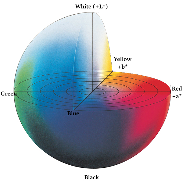
Today, L*a*b* in most print shops is measured by a spectrophotometer and many digital art frameworks allow specification by L*a*b* even as the displays they’re working with are nearly always in a RGB-derived color space.
XYZ
Describing CIEXYZ falls outside the scope of a “gentle” introduction so any subject matter experts who have found this post by accidents must forgive me. You can go into the weeds on your own with the wikipedia entry on the CIE 1931 color space but for our purposes, CIEXYZ has a one-to-one correspondance with CIELAB, although unlike CIELAB it is not perceptually uniform.
HSV
We now get into the world of digital color. Technically HSV is not a perceptual color space but a transform of the RGB color model (more on this later), but it acts like one and you’ll see why in a moment. HSV stands for Hue, Saturation and Value. Hue is measured as an angle on a color wheel. Color wheels date back to Isaac Newton who projected the rainbows he saw from his prisms onto the angles of a circle. This cyclical nature of color doesn’t match with the physics, but seems to match with our perception of color. There’s something about purple that makes it seem like it falls between blue and red.
Saturation is how much of a hue is included - at its lowest values, all colors are gray. Value (or L for lightness) is bright to dark. It’s a 3 space like LAB but because it’s mapping from RGB, it can’t describe quite as many colors.
HSV’s big plus is that if you’re trying to choose a color, and it’s not quite right, there’s a nice ordinal way to nudge the color one way or another. “That’s too green” becomes “decrease the hue angle”, “That’s too garish” becomes “lower the saturation value”, “Make it brighter” becomes “increase the value”. Because it’s a map to RGB, there’s a one-to-one correspondance in your HSV that you just tuned and the RGB color you’ll get to use.

Display Based Color Systems
RGB, but make it complicated.
RGB (red/green/blue) developed originally in photography and television. Each layer was a monochrome (black and white) and a light filter collecting red green or blue light would first capture the right amount of luminance for that color and then project it back for display. In 1940, CBS was doing this with a color wheel spinning at 1200 rpm aligned with the difference layer monochromes. 7 The proper response to this is “Whoa.”
But RGB’s relevance really developed with display systems for personal computers. RGB displays work by having three small and close light sources in each of the colors and the intensity of that light is driven by the RGB values. Because these are light sources, the system is additive (more is more). Low saturation colors exists when all 3 values are equal. Higher saturation when there are big differences between the three values. This is true whether we’re talking about Cathode Ray Tubes or LCDs.
What’s really important to understand about RGB (as opposed to Lab or spectral color) is that it’s not a color space. It’s a way to encode a color that can be decoded by a graphics card. To map RGB to an actual real life color, it’s necessary to use a RGB-based color space. sRGB is the default and is what we use for “web colors”, but Adobe has their own that maps to a greater color gamut (i.e. more colors). What this means in real terms is that an sRGB triple and an AdobeRGB triple map to different colors (although they’re likely to be quite similar).

The CIE also has an RGB color system that was developed in a set of experiments based on human perception and more information about it is in the link in the XYZ section.
A quick word about hexcodes
In browsers, RGB colors are usually encoded as hexcodes - where the first two digits map to red, the second two digits map to green, and the last two map to blue. They’re in hexadecimal - each digit can be any of the following: 0123456789ABCDF. Because each digit can be one of 16 different values, the total number of values that can be encoded is \(16^2\), or 256. So a color that has 0% red, .39 green, and .45 blue would be “#006373”
Ink/Printing/Pigment
We’ve talked about how we see color, we’ve talked about how computer systems display color, but there’s one big piece of color math and color management we’re missing: how to make color in the real world.
CMYK
Probably the simplest print model is CMYK or “Cyan”, “Magenta”, “Yellow”, “Black”. CMYK is a subtractive system. With RGB higher values mean higher brightness - with “#FFFFFF” being white and #000000 being black in hexcode. With CMYK, the more ink the more it absorbs light so if you’re at 100% C, 100% M, and 100% Y, that’s the same as 100% black. If you’re talking about your color desk jet printer, each pixel gets squirted with the appropriate amount of ink to achieve the desired color. This is why when your ink levels drop asymmetrically, some of your prints come out with the right print content but the wrong colors. For a commercial offset printer, each color gets its own plate that will place the right amount of ink in the right spots.
Like sRGB, CMYK can not achieve all colors that the eye can see. Fancier printers might include orange, green, and violet ink for its process (mixing) colors. Commerical printers can print in “spot” colors, inks not meant to be mixed with others at print time but formulated separately to a manufacturer’s specification.
Okay, now you know about the various color specification systems, let’s use python to go from one to another.
Footnotes
-
If you haven’t read part 1, that’s probably okay. You’ll figure it out. ↩
-
The colors are just for reference. We’ll talk more in detail later about display colors but for now just trust these curve make a color something like that. ↩
-
These curves are more “jagged” than what you’d expect from a measured spectrophotometer - I just generated these randomly with some peaks. ↩
-
https://en.wikipedia.org/wiki/Cave_painting ↩
-
In recent years, Philips (of Hue fame) has repeated the experiments conducted by the International Commission on Illumination (CIE) with modern abilities to more finely grade differences between colors. Turns out a* and b* aren’t actually perceptually uniform and the weights are off. We can detect smaller differences in a* than b*. Oops. ↩
-
(h/t) https://sensing.konicaminolta.asia/ ↩
-
https://en.wikipedia.org/wiki/Field-sequential_color_system ↩
-
(h/t) https://en.wikipedia.org/wiki/SRGB ↩