At a recent PyData PDX meetup, I presented on the 5 things I like about seaborn the most.
Most of the time when I make figures for my work, I use matplotlib. When I tell people that, they’re often baffled, skeptical, or just think I’m weird. But I like matplotlib - it’s low level, you can adjust a lot of things with it, make custom figures. I even used it to layout the table apron for the standing desk I built. But I still prefer to use Seaborn for a few things. I want to outline those for you now.
import matplotlib.pyplot as plt
import numpy as np
import seaborn as sns
import pandas as pd

data = sns.load_dataset('penguins')
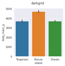
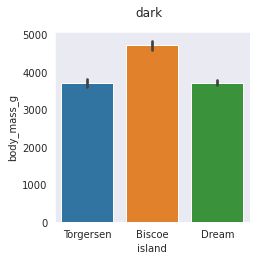
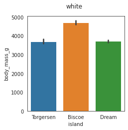
Number 5: Setting Style/Context
Really, the aesthetics of your figures are the results of style sheets. Seaborn comes loaded up with a few “contexts” and “styles” that can change the global settings for things like background color, visible ticks in your figure, font size, and the like. Here are some examples of the four main styles:
for style in ['darkgrid','whitegrid','dark','white']:
    with sns.axes_style(style):
        fig, ax = plt.subplots(figsize=(3.5,3.5))
        fig.suptitle(style)
        sns.barplot(x='island',y='body_mass_g', data=data)
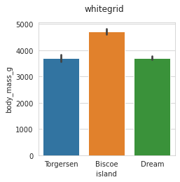
I like whitegrid the best so we’ll set rest of the figures to whitegrid:
sns.set_style("whitegrid")
Next, there’s a “context” setting - is this figure going to be in a paper, a jupyter notebook, a talk, or on a poster? All of those have impact on the relative font sizes you want to use. Here are those examples.
for context in ["paper", "notebook", "talk", "poster"]:
    with sns.plotting_context(context):
        fig, ax = plt.subplots()
        fig.suptitle(context)
        sns.barplot(x='island',y='body_mass_g', data=data)
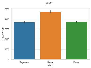
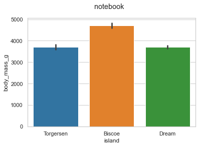
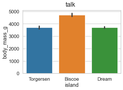
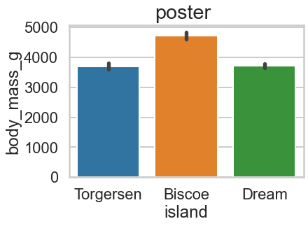
We’re going to set ours to notebook since that’s where these are being seen from.
sns.set_context('notebook')
Number 4: The Palplot
Coming in at number 4 is the “palplot”. I hear lots of argument around color palettes, the right ones to use, what not to use - but in the end, color palette is primarily a design question and you want to make your figures pretty. It may seem trivial, but studies have shown being happy and having positive emotions actually helps you learn more complex concepts.
That’s where the palplot comes in. It allows you to load up a sample color palette and just see how the colors look together.
This is the default matplotlib palette
sns.palplot(sns.color_palette())

A color palette can be entered as just a list of hexcode strings - remember to put the “#” ahead of it.
palette = ["#003f5c","#58508d","#bc5090","#ff6361","#ffa600"]
sns.palplot(palette)

palette = ["#fffcf2","#ccc5b9","#403d39","#252422","#eb5e28"]
sns.palplot(palette)

palette = ["#e63946","#f1faee","#a8dadc","#457b9d","#1d3557"]
sns.palplot(palette)

I like to use the colors provided to me by the marketing department of my company so that I know when they inevitably take my figures entirely out of context and drop them in a presentation, at least the colors won’t clash.
company_colors = ['#005A96', '#FF9E15','#8fc53c',"#41b6e6",'#cb6015','#2c704F',]
sns.palplot(company_colors)
sns.set_palette(company_colors)

Number 3 Joint Plots
Coming in at number 3 is joint plots. I generally eschew pre-designed figures and prefer to build mine from the ground up but jointplots just have so much going on that it would be annoying to roll my own and they’re pretty awesome just as is.
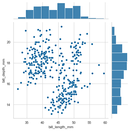
They can show you the distribution of variables.
sns.jointplot(data=data, x="bill_length_mm", y="bill_depth_mm")
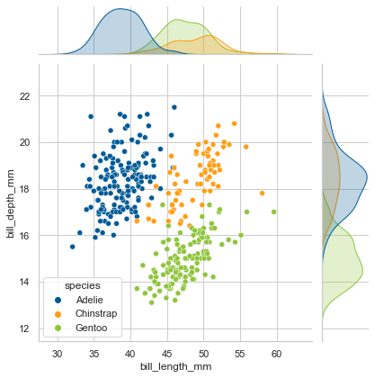
If you have a third facet that’s categorical, you can see those distributions separately.
sns.jointplot(data=data, x="bill_length_mm", y="bill_depth_mm", hue="species")
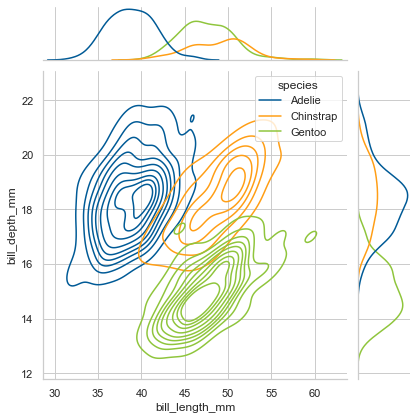
My personal favorite is kernel density estimation contour plots.
sns.jointplot(data=data, x="bill_length_mm", y="bill_depth_mm", hue="species", kind="kde")
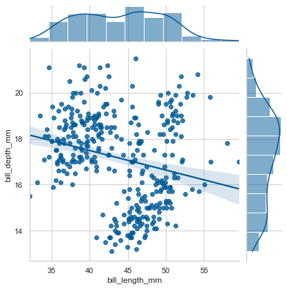
It can even do a regression plot for you complete with slope/intercept confidence intervals based on a bootstrap analysis of your data.
sns.jointplot(data=data, x="bill_length_mm", y="bill_depth_mm", kind="reg")
Number 2: How Easy it is To Add Facets and Change Them
Number 2 is just how easy it is to change facets. Most of my figure blocks end up being 10+ lines long, because I’m altering the aesthetics, adding annotation, making sure all the labels are right, but especially for just exploratory data analysis, I really like seaborn’s ability to just pass a string into the dimension you want.
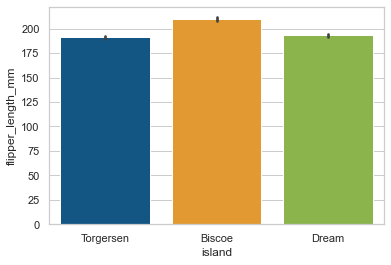
sns.barplot(x='island',y='flipper_length_mm',data=data,)
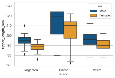
Go ahead, throw on another facet.
sns.boxplot(x='island',y='flipper_length_mm',data=data,hue='sex')
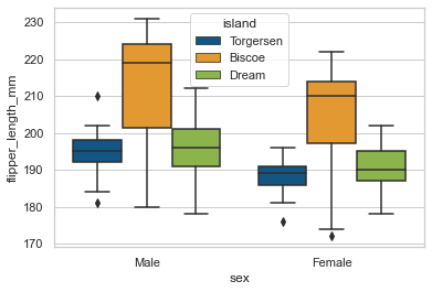
Oh, wait, let’s swap the x and the hue facets.
sns.boxplot(hue='island',y='flipper_length_mm',data=data,x='sex')
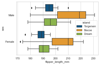
How about we make ‘em horizontal?
sns.boxplot(hue='island',x='flipper_length_mm',data=data,y='sex')
You may still want to adjust size, labels, etc but you can do so just by calling the sns axes figure and telling which axis to put itself on.
fig, ax = plt.subplots()
sns.boxplot(hue='island',x='flipper_length_mm',data=data,y='sex',ax=ax)
My number one favorite thing about seaborn: The XKCD name -> hex color dictionary
Randall Monroe of xkcd fame ran a survey a zillion years ago asking people to map names onto various RGB colors. The result is this page
Seaborn has taken that page and written it into a dictionary you can call from.
colors = [sns.xkcd_rgb[color] for color in ['peach','rust','sea blue','light olive','bluish green']]
sns.palplot(colors)

This is by far my favorite thing about seaborn. It’s so silly and simple but it’s much easier to remember a color by its name than it’s hexcode.
I hope this was as fun for you as it was for me!